Case study · Brand progression · menu creation · takeaway
From nine directions to a full takeaway system.
Overview
Spice Box is the clearest progression story in the portfolio: early SB monogram routes, charcoal-and-red systems, campaign-style takeaway layouts, then a mid-project pivot into the warmer brush-script identity the family actually wanted. The work finished as a joined-up brand, packaging, shopfront and A3 six-panel menu system.
Build
Everything that shipped, nothing behind a tap- 01
Full visual exploration
The project started with multiple directions: painted heat, stencil restraint, geometric menu kits, heritage badges, deep red minimalism, and bold campaign layouts. Each route tested how the brand would behave on menus, boxes, social posts, and signage.
- 02
Mid-project brand pivot
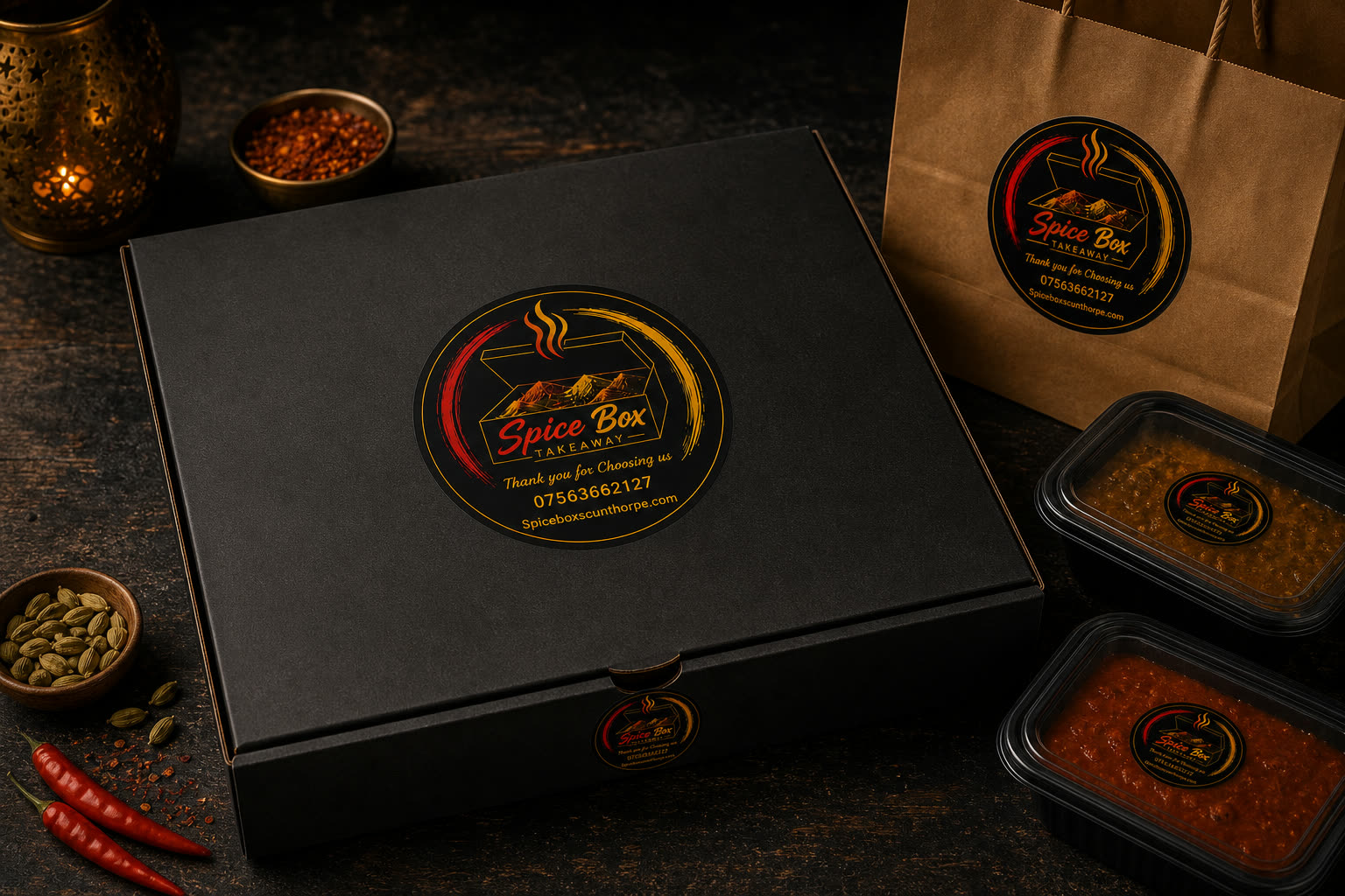
The original SB monogram direction was not forced once the stronger family preference appeared. The system was rebuilt around a custom brush-script wordmark, open spice-box mark, red-orange-yellow colour movement, and a warmer takeaway personality.
- 03
Brush-script identity
The final direction uses a hand-crafted SpiceBox wordmark, a spice-box icon, black backgrounds, bold warm highlights, and clear supporting type so the brand can be loud without becoming messy.
- 04
A3 six-panel menu architecture
Menu content was reorganised into two clear sides: loaded boxes and modern specials on one side, traditional curries and takeaway staples on the other. Prices, allergens, hours, address, phone and online-order incentive all had to fit without looking like a spreadsheet.
- 05
AI direction, human rebuild
AI image direction helped explore atmosphere and layout quickly, but the final menu was rebuilt around locked menu data so item names, prices, categories, and contact details stayed controlled.
- 06
Packaging, stickers and shopfront
The final system was stress-tested across takeaway boxes, sticker seals, social cards, food imagery, and shopfront signage so the identity works beyond a logo file.
Progression
The pivot became the story.
The valuable part was not pretending the first direction was final. It was showing the exploration, listening to the family response, and rebuilding the brand around the route with the clearest personality.
- 01
Early exploration
Painted, stencil, saffron, monogram, deep-red and campaign-heavy routes were all explored as possible ways to make the takeaway feel bold but not generic.
- 02
SB monogram phase
The first serious system centred on a stamp-style SB mark and restrained charcoal/red palette. Useful, but ultimately too reserved for the family direction.
- 03
Brush-script pivot
The approved route moved toward a warmer brush-script wordmark and open spice-box icon. It felt more handmade, more Indian-kebab fusion, and more suitable for a local takeaway.
- 04
Surface testing
The new identity was tested on boxes, stickers, shopfront signage, social posts, and food-led hero images before being treated as the current system.
Menu creation
The menu had to sell and stay accurate.
The menu work became its own product: not just a nice graphic, but a structured print asset with locked dishes, prices, allergens, opening hours, address, phone number, and a clear online-order incentive.
- 01
Locked menu data
The menu was rebuilt around confirmed categories, dish names, prices, opening hours, phone number, address, allergen note, and the 10% online-order incentive.
- 02
Two-sided logic
Loaded boxes, kebabs, burgers and specials sit on the modern side. Traditional curries, biryani, rice, breads and starters sit on the classic side.
- 03
AI concept to controlled artwork
AI concepts helped find the dark, hot, food-heavy direction quickly. The final artwork then had to be controlled by real copy, real prices and readable layout.
- 04
Print and web handoff
The same menu system can support folded print menus, website sections, social posts and ordering calls-to-action without rewriting everything from scratch.
From first routes to the current menu system.
Next
Tell us what you do — we’ll show you what your version could look like.